SaaS Pricing Page Design That Converts
The pricing page converts visitors into trial users. Seven-section anatomy of a high-converting page, the pricing mistakes that kill conversion, and the A/B tests worth running to maximise trial start rate.
The Page That Converts Visitors Into Trial Users
A SaaS pricing page is the dedicated web page that communicates subscription plan options, features, and prices to potential customers. It is one of the highest-impact conversion pages on a SaaS marketing website because it is where prospects make the final decision to start a trial or request a demo. An effective SaaS pricing page displays three clear tiers, highlights the most popular plan, lists the specific features in each tier, includes social proof, and has a single prominent call to action per tier. Hiding pricing or requiring a sales call to see prices significantly reduces trial start rates for SMB-focused SaaS products.
The SaaS pricing page is often the last page a prospect visits before deciding to sign up or leave. Every element on the page should remove friction, build confidence, and make the conversion decision feel low-risk. Research consistently shows that transparent pricing pages convert at higher rates than pages requiring a demo request to see prices.
What Each Section Must Do
Headline: state the value, not the product
The pricing page headline should reinforce the product’s value proposition, not just say ‘Pricing.’ Examples: ‘Simple pricing that scales with your team’ or ‘Start free. Grow with us.’ The headline sets the emotional tone before the prospect sees any numbers.
Three pricing tiers with clear names
Three options (Starter, Growth, and Scale or Pro) create the comparison that guides customers toward the recommended plan. Two options feel insufficient. Four or more create paralysis. The middle tier is always the recommended option and should be visually distinguished with a highlight, badge, or colour accent.
Annual vs monthly billing toggle
A toggle that switches between monthly and annual pricing allows the prospect to see the savings immediately. Annual pricing shown at the monthly equivalent (e.g. ‘$79/month, billed annually’) with the ‘Save 20%’ badge consistently increases annual plan adoption at checkout.
Feature comparison table
Below or alongside the tier cards, a complete feature comparison table showing exactly what each tier includes. Do not list generic features like ‘Email support.’ List specific, valued capabilities: ‘Priority support with 4-hour response time.’ Specificity builds trust.
Social proof section
Three to five testimonials from customers on each plan tier, showing the plan name alongside the testimonial. This helps prospects at each price point see themselves in the testimonial and reduces the ‘this product is not for companies like mine’ objection.
Frequently asked questions
Six to ten FAQ items answering the specific objections prospects raise before purchasing: Can I cancel at any time? What happens to my data if I cancel? Do you offer refunds? Can I change plans later? FAQ sections consistently reduce support ticket volume and increase conversion.
Enterprise or custom plan option
A clear pathway for large organisations to contact sales. Even if you do not have enterprise customers yet, the ‘Enterprise: Contact Us’ option signals that the product can grow with the customer and removes the ceiling from the perceived product scale.
🔗 Related reading on Simple Automation Solutions
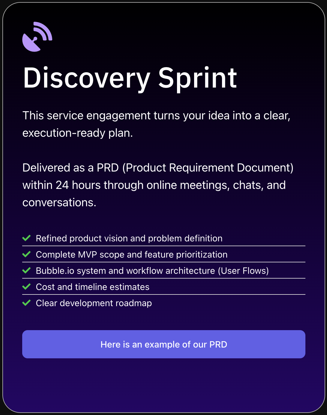
What Is a Discovery Sprint — The Smart First Step Before Building
SA’s Discovery Sprint includes pricing strategy design as part of the complete product requirements document.
What to Avoid
| Mistake | Impact | Fix |
|---|---|---|
| Hidden pricing (request a demo to see prices) | 60-80% of SMB prospects leave immediately | Show pricing publicly; reserve sales-only pricing for enterprise only |
| Too many plans (5+) | Decision paralysis reduces conversion | Three plans maximum for self-serve SaaS |
| Features listed by name only | Prospects cannot evaluate value | Describe each feature by its specific outcome, not its name |
| No annual option | Higher churn; lower cash flow | Always show annual pricing with visible discount at checkout |
| No social proof on the pricing page | Higher doubt and objection rate | Add 3-5 named testimonials with plan tier attribution |
| Complex usage-based pricing without a calculator | Prospect cannot estimate their bill | Add a simple cost calculator or show example pricing scenarios |
| Missing FAQ section | Increases pre-purchase support tickets | Add FAQ addressing top 8 objections |
High-Impact Experiments
Annual vs monthly default
Test showing annual pricing as the default (with monthly as the switch option) versus monthly as default. Annual default consistently increases annual plan adoption without reducing total conversions.
Highlighted plan position
Test which plan to highlight as ‘Most Popular’ or ‘Recommended.’ Most SaaS products highlight the middle plan. Test if your conversion data suggests the higher plan should be highlighted.
Feature list order
Test showing the features most valued by your ICP at the top of each tier’s feature list. Analytics from support tickets and customer interviews often reveal that the features listed last are actually the most valued.
🔗 Related reading on Simple Automation Solutions
How to Build a SaaS Product From Scratch in 2026 Without Writing Code
Complete guide to building your SaaS from data model to pricing page, using Bubble.io.
Free SaaS Tech Audit — 30 Minutes, No Cost
Athar Ahmad personally reviews your SaaS product: security vulnerabilities, billing architecture gaps, and performance anti-patterns identified before they cost you customers, deals, or investor confidence.
- Multi-tenant security and privacy rule assessment
- Stripe billing architecture review
- Performance bottleneck identification
- Written remediation roadmap within 24 hours
Q: Should SaaS pricing pages show annual or monthly prices?
Show both, with a toggle to switch between them. Display annual pricing as the monthly equivalent with a ‘Save X%’ badge when annual is selected. This framing consistently increases annual plan adoption at checkout compared to showing only the annual lump sum.
Q: How many pricing tiers should a SaaS have?
Three tiers is the proven optimal number for self-serve B2B SaaS: Starter (entry point), Growth (recommended, highlighted), and Scale or Pro (high-value customers). More than three creates decision paralysis. Fewer than three leaves revenue on the table by not segmenting willingness to pay.
Q: Should I hide pricing and require a demo?
Only for enterprise SaaS with minimum contracts above $10,000 per year. For SMB-focused SaaS, hiding pricing reduces trial start rates by 60-80%. Prospects who cannot see your pricing without booking a call will choose a competitor who shows theirs. Transparent pricing converts better for SMB SaaS products.
Build or Fix Your SaaS the Right Way
Free Tech Audit for SaaS products that need assessment. Discovery Sprint to scope new SaaS ideas correctly before building. Both lead to better commercial outcomes.